Impressions from 3 Days of Design
When you can’t go to Milan, you join in on 3 Days of Design in Copenhagen, with what feels like the next best thing.
This year, I hosted my own little exhibition in collaboration with Eberhart Furniture on the first day, Thursday, which you can see and read more about here. This left me roaming around the venues of Copenhagen on Friday and Saturday, with one pre-3DD event in Nordhavn on Wednesday.
I explored all of the places featured here for my own interest. No press tours with a list of places to sporadically visit. I went to places that I wanted to go see, because I wanted to.
The Audo
Last year, everyone wore Bob-the-builder helmets at The Audo residence, which was a mere buiding site back then. This year, they opened the doors to their new boutique hotel, co-working space, café, restaurant and concept store - a multi purpose space located in Nordhavn, Copenhagen.
MENU have joined forces with Norm Architects to create a new space called The Audo, meaning ‘From one, learn all’ — A strong and poetic Latin lyric, that anyone can read anything into. CEO and founder of MENU Bjarne Hansen and Jonas Bjerre-Poulsen from Norm Architects both claim that The Audo is ‘a testimony to the future of design’.
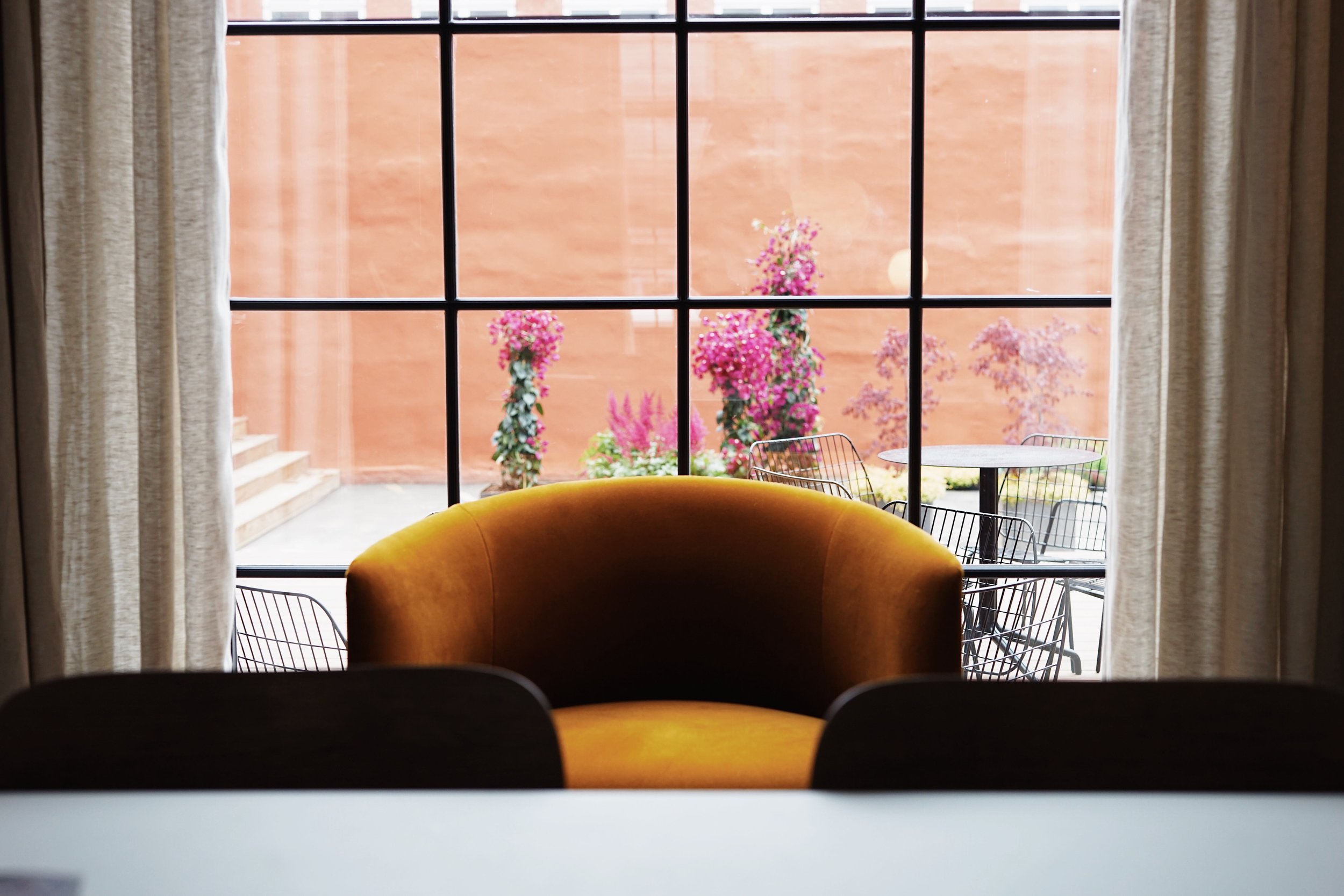
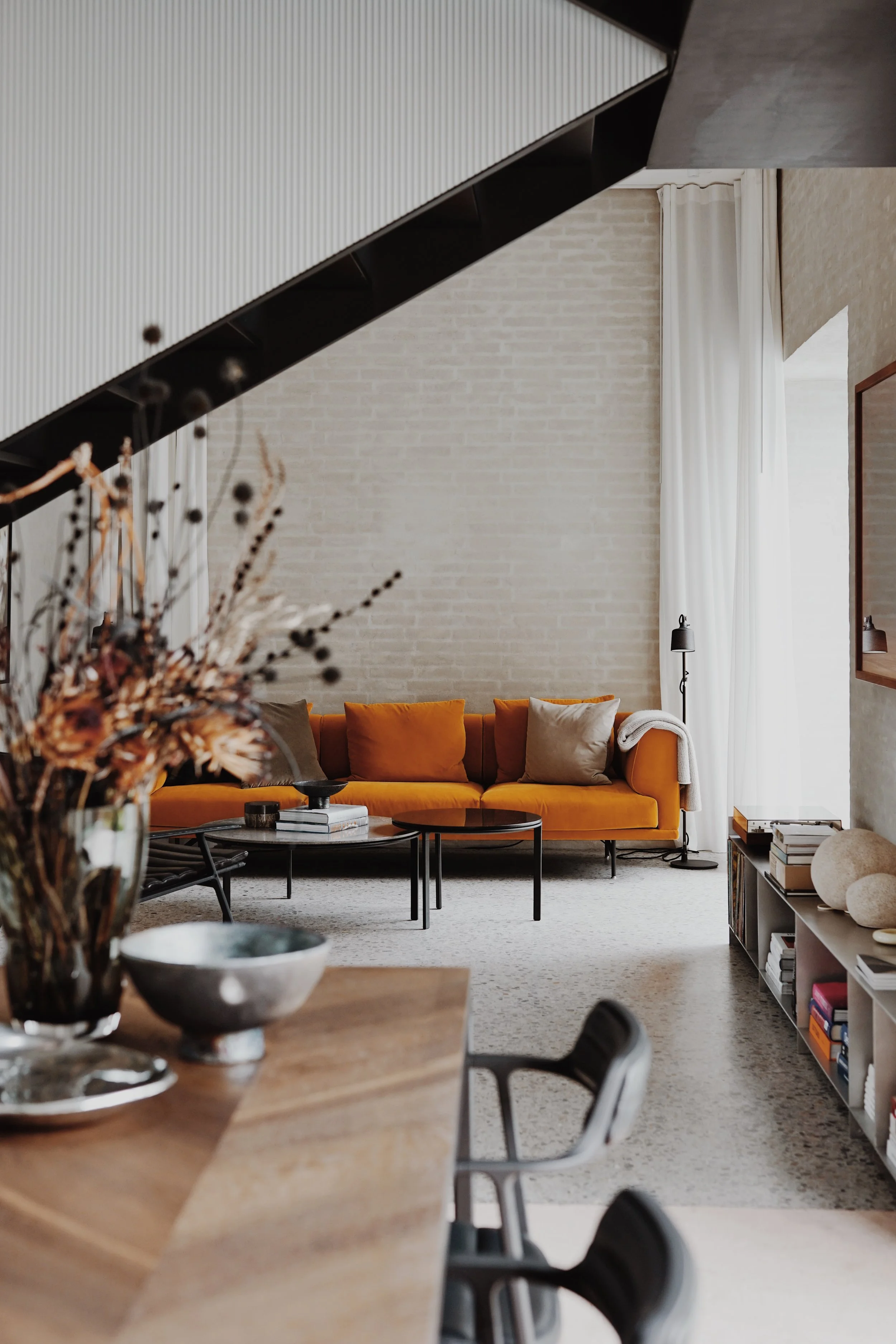
From furniture to lighting to accessories and wall colours - the MENU DNA is present in every room, visually creating a harmonious space, that allows the eyes to rest on a carefully curated pieces. The hotel rooms offer beamed ceilings, luxurious DUX beds and stone/marble bathrooms that are beautifully interlinked with the rest. I loved this space, especially the terracotta coloured walls. And speaking of having a favourite, if you decide to book a stay, you are not randomly given a room upon arrival like most other hotels. Part of the concept here is that you can preview the rooms online prior to booking, pick your favourite, and reserve that exact room for your stay. A feature dedicated to the design lovers and people to whom colour, layout and light matters.
Dawn Exhibition
I’ve always loved Nomad Workspace, because of all colours of course. Dawn Exhibition offered a platform for emerging artists and designers, as well as established brands, to showcase their work. This year, an ensemble of creatives exhibited here, on different floors, in different corners and rooms.
Ursula Nistrup
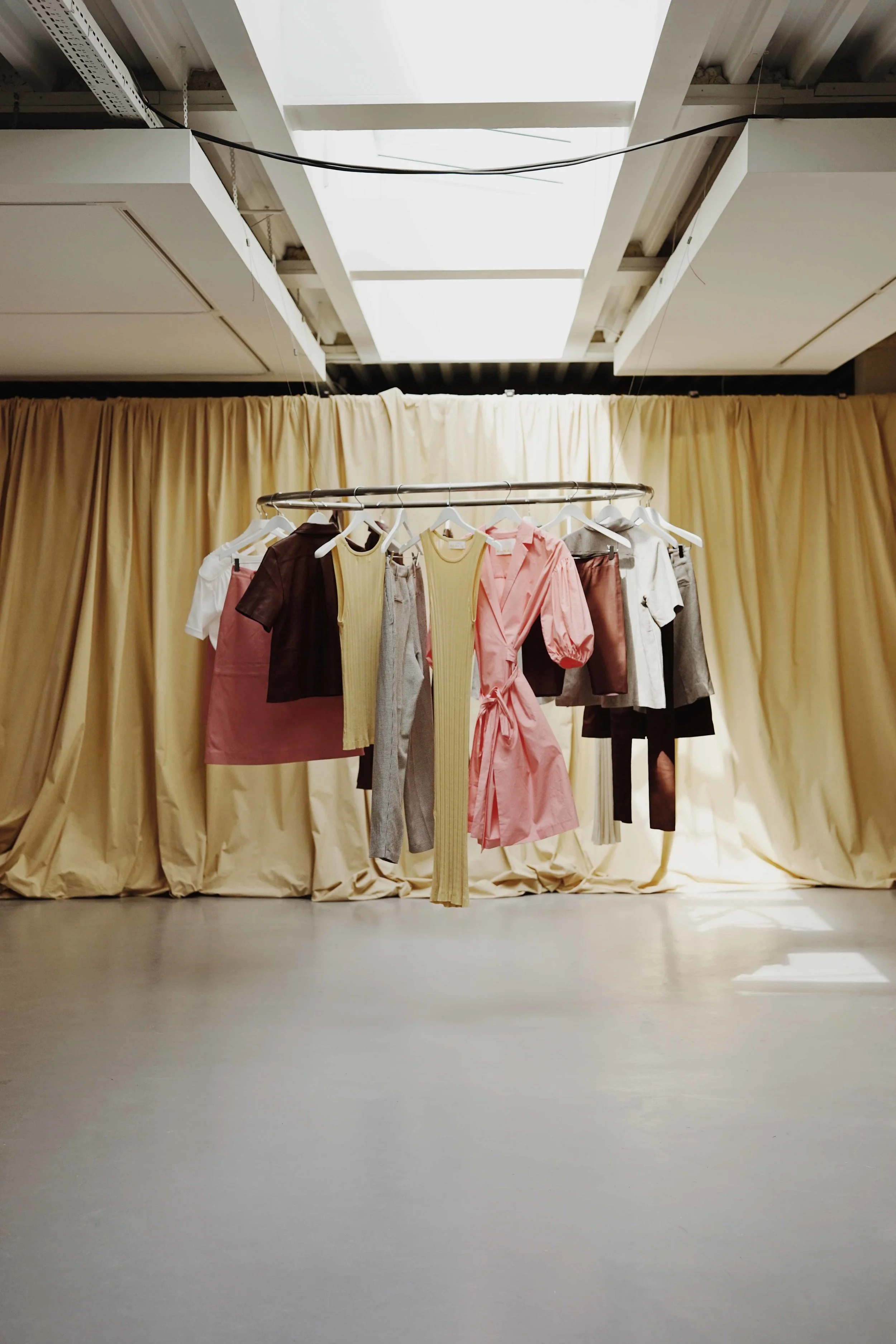
Intricate textures and pleats, curated beautifully to match the raw walls and the concrete casts.
Helle Mardahl
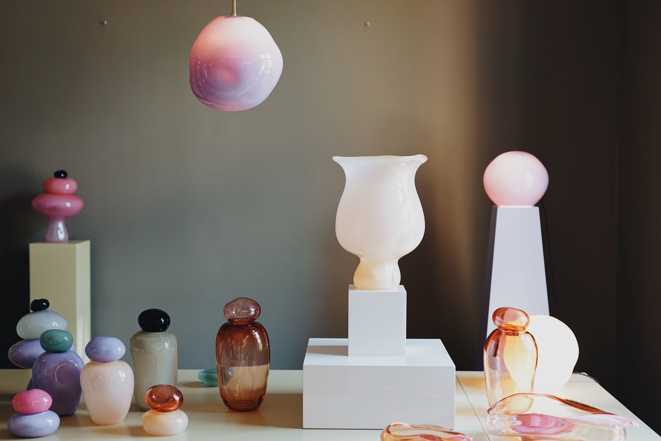
Colourful glassware that made everyone smile. It’s so playful and so very her.
Anne Nowak
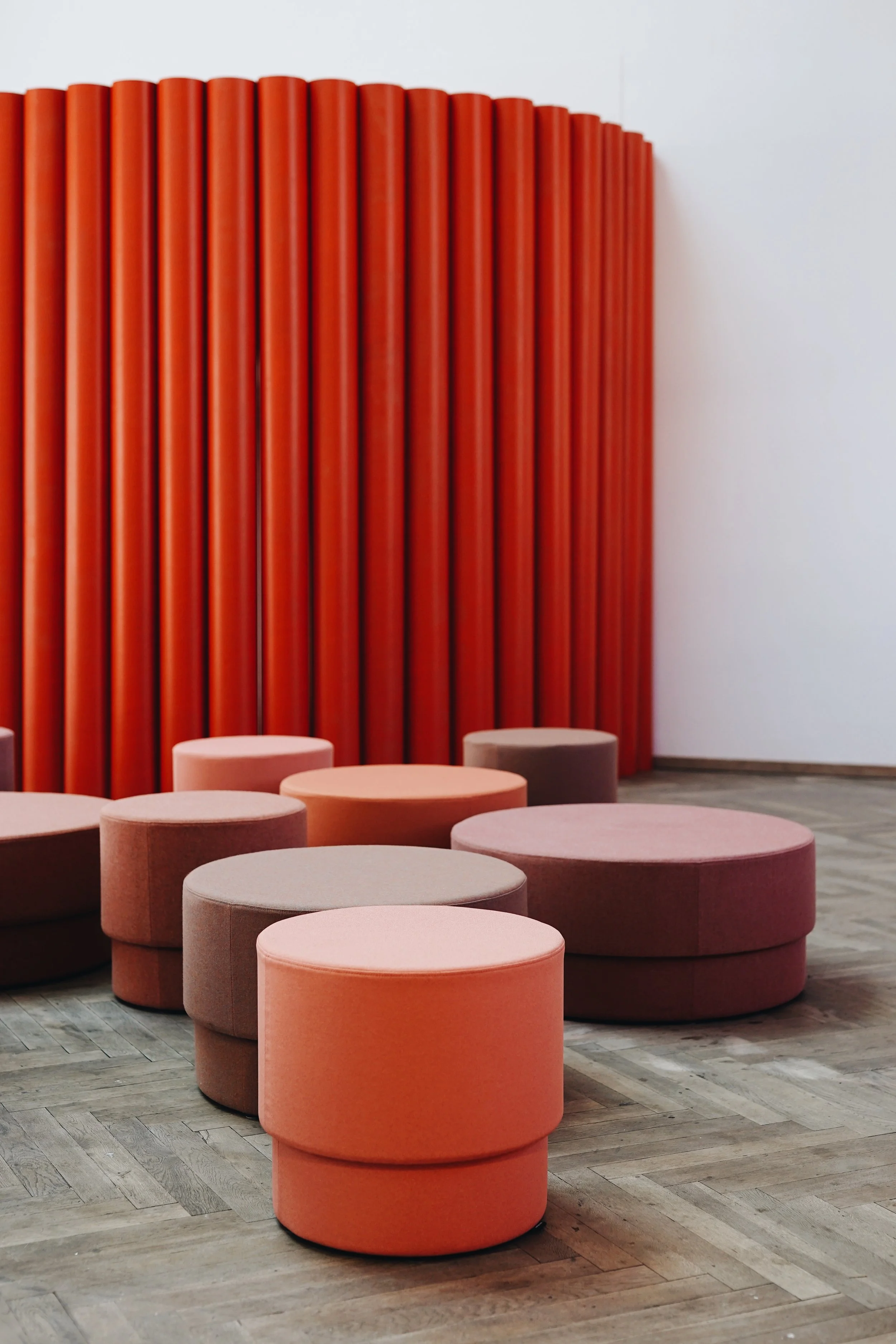
Gradient heaven. I love Nowak’s work and her deliberate use of super vibrant shades. And then I just enjoyed how these walls made you feel like you were not in Copenhagen, but rather somewhere in sunny L.A.
Frama x House of Grey
The space where Frama resides, an old apothecary, is a fascinating one. They’ve maintained the wooden shelves, and are only storing very few items on them as a part of a display. It really makes the architecture of the room stand out. And perhaps this is their trick - they’ve learned from their surroundings and adopted this as their identity. They do very little to manipulate, or to change the space too much, but rather embracing what’s there. I love their philosophy and their approach to design, but mostly, I just respectful of how they honor the space and its history.
For 3 Days of Design, interior stylist Louise Grey from House of Grey had curated the studio under the name ‘Senses’. Also, Frama launched a new scent that I loved called ‘Beratan’. Still can’t find it online, but I’m sure it will be available soon.
Studio x Viaduct
This place was just down my alley. Colour, in a subtle but still present way, and then the space too. Raw concrete ceiling, warm wooden floor, large arched windows that had been painted blue, and stairs in blushing coral orange. I don’t know why, but I felt like I was in Stockholm here, which is a good thing for sure. Enjoyed how one of the girls there accidentally walked into my photo, to match and blend in with the place 100% because of her lovely outfit.
I was both ‘surprised and delighted’ by this space (which is totally Kirstine’s aim), and have come to love baby blue ever since spotting it on the sofa and the wooden furniture there.
Norm Architects x Karimoku Casestudy at Kinfolk
The Kinfolk Gallery has a certain vibe to it, that enlightens any exhibition. This space really suited the Japanese furniture, and vice versa. They really did go perfectly hand in hand. Minimalist grey, wooden furniture and large art pieces on the wall and on display, is a combination that never grows old. But it is also a combination that doesn’t make me clap my hands and bow either. Not because of dislike, but because it has grown a bit too grey for my taste over the past year. Had the art on the walls been in a statement colour, or had the rug had a more contrasting pattern on it, it would have gotten me a little more excited I’d say. Needless to say, I loved hearing the story behind this collaboration, and I enjoyed even more to talk to some of the people behind it. I’m eager to see more of what this design venture can become. Oh yes, and I too enjoyed the look of the Yuzo sake and the dried fish, contrasting and/or complimenting the wooden pieces.


